

Let’s start with a little experiment… you’re trying to pick a movie for a date with the charming person you met on chatroulette. You fire up the movies app on your phone to watch a few trailers. Which of these would you definitely not click on?

Perhaps you can’t tell the difference between blue steel and le tigre, or maybe you staunchly support Marvel and refuse to watch a DC movie, but if you’re anything like me you’d skip right over Mountain Men. An incredibly rigorous and official poll I conducted confirmed I was not alone in these preferences. Yet, despite widespread agreement that Mountain Men was probably a bad movie, people struggled to describe what made it seem so 'dumb' or 'hokey.' What specific visual features of it's poster convey this message?
Visual Perception or: How I Learned to Stop Worrying and Love Neural Plasticity
As humans, we’re good at recognizing a friend’s face or finding our keys on a messy desk-- and we get better at these visual tasks with practice. For example, radiologists undergo countless hours of training to improve their ability to detect anomalies in medical images. How does this work?
The visual system extracts features from the world. At early stages of visual processing, simple cells in primary visual cortex are sensitive to edges and orientations. As we move up through the cortical hierarchy, we find areas responsive to more complex features including angles, motion, and combinations of features.
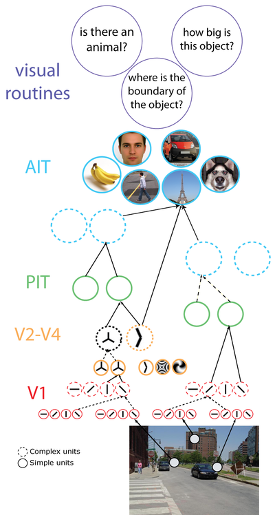
Through learning and experience, we discover that certain combinations of features are associated with particular objects and outcomes. For example, we might expect warmth when we see the lines and contours of our mother's face, or experience fear upon seeing the sharp angles of a gun shaped object. As we learn these associations, connections in our brain can re-wire or the strength of synaptic connectivity can be modulated to promote processing efficiency through a process of neural plasticity. This kind of learning extends throughout our visual lives including, of course, movie posters. Since the process of learning these associations is largely automatic, it's often difficult for us to describe what, how, and why certain features matter.
Recent advances in machine learning use a similar process of feature extraction to learn about arbitrary relationships in data. This means that we can turn to machine learning -- or, more specifically, to convolutional neural networks -- to help us get a sense of the features that make Mountain Men seem like a bad movie.
The ConvNet Rises
Convolutional neural networks (ConvNets) are a powerful form of deep learning which has proven to be extremely accurate in a wide range of image recognition tasks. They operate by applying convolutions -- or filters -- across an image. Each filter can be responsive to different features of the image. Filters at early layers of the network tend to pick out low-level properties of the input image including spatial frequency, edges, and color. As we continue to stack additional convolutional layers, more complicated filters begin to emerge.
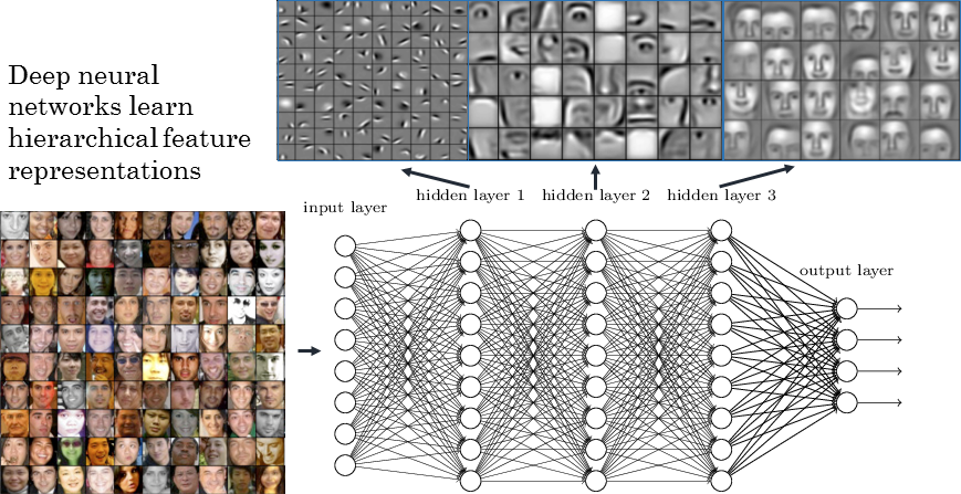
If you think this sounds strikingly similar to my description of the visual system above, you're indeed correct! There are certainly similarities (enough to warrant a symposium at this year's Vision Sciences Society conference), although there are also plenty of notable dissimilarities. Interestingly, by looking at the output of a convolutional net we can begin to understand what properties of an image contribute to its classification in a particular category.
No Country for Bad Posters
Just in time for the Oscars, we decided to ask a ConvNet what the difference is between the posters of good movies and bad movies. To do so, we collected a set of 19,083 films released from 2001-2015 along with their movie posters. We first performed a stratified split on the movies to get the worst (those with an IMDB rating under 5.5) and the best (those above 7.0). We then trained a ConvNet to classify the posters of good and bad movies.
Technical details: We used Lasagne and nolearn to train GoogLeNet, a 22 layer deep network with over 10 million parameters, on the movie poster dataset using an NVidia GTX 980 GPU. The initial weights were loaded from the pre-trained model and we fine-tuned the weights with a full day of training. Our final model achieved 68% accuracy on a separate validation split (50% is random chance).
The Usual Suspects?
We then used the trained network to classify 2,500 movie posters it hadn't yet seen. By looking at what it thinks are the best and worst movies based on their posters, we can begin to understand the features that are important for this distinction.
Here's a random selection of our classifications organized from best to worst (refresh for more):
Looking at this array of movie posters, we can tell there are some obvious qualitative differences between good and bad movies:
Movie posters of good movies tend to have clean, minimalistic design. Many feature a single color throughout the entire poster. In contrast, posters of bad movies tend have much busier design with multiple colors and textures.
Posters of good movies tend to use simple, horizontal sans serif fonts, while posters of bad movies seem to be inspired by Microsoft Word Art circa 2005.
Similarly, a common feature of bad movie posters seems to be red fonts, often slightly tilted. These features to be most prevalent in horror and ‘college’ type movies, of which almost all are universally regarded as terrible.
Interestingly, the ConvNet seemed to pick up on the fact that many well rated movies tend to place the laurel leaf award on the movie poster. So, in order to trick you into thinking this is a good blog post, I’ve added a laurel leaf award.

The Good, the Bad, and the Ugly
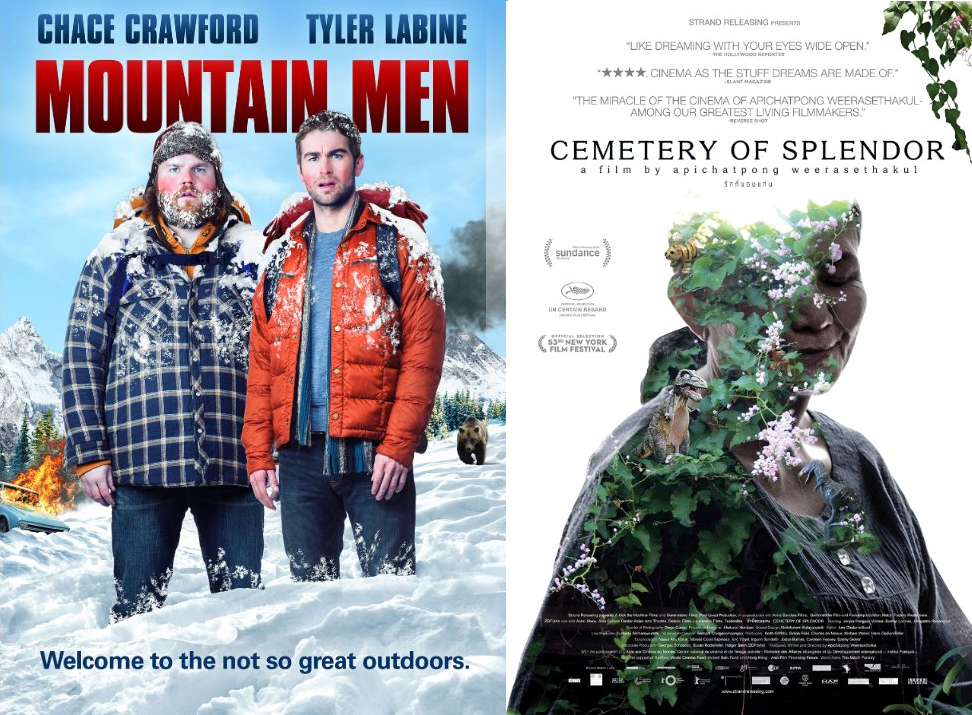
So, what was it about Mountain Men that seems so bad? Our model agrees with me about its quality: it is 82% confident that Mountain Men is a bad movie, while it's 73% confident that another movie on the page, Cemetery of Splendor, is a good one. It seems Mountain Men exhibits many of the traits of bad movies - most notably several overlaid textures and bright red text, while Cemetery of Splendor has clean white design with multiple laurel leaf awards.
Does this mean that a we can add laurel leaves and clean fonts to the movie poster of a terrible movie and it will suddenly become good? Of course not. But it does mean that you could do so to try to convince people to see your movie. Given that many individuals implicitly have learned these associations, people might be more likely to engage with a poster that exhibits visual features of better movies. Indeed, more movies were misclassified as good than bad likely because of this: people who make bad movies might be able to create a great poster, but no one who is making a great movie accidentally makes a poster like Mountain Men or Jock: The Hero Dog.
One important limitation of this analysis is that we focused entirely on IMDB ratings and not, for example, box-office grosses. It's not necessarily the case that higher rated movies are higher-grossing than lower rated movies. Moreover, as we've previously discussed (see our post on movie ratings), critics and fans don't always see eye-to-eye, so we might expect different patterns to emerge if we based our analysis on Metacritic ratings.
See the code for the ConvNet on our Github.

